Highlights
- Mario’s appearance has evolved over time, showing more details but can lose the original charm if overly realistic.
- The transition from red to blue overalls occurred in
Mario Bros.
in 1983, not appearing in
Super Mario Bros.
until later. -
Super Mario Odyssey
represents a shift towards more realistic and detailed character design, compared to original simplistic appearances.
The Mario game franchise has been around since 1983 and has seen many design changes over the years as technology improves. Mario’s first ever appearance was a sprite composed of just 4 colors, but it has come an incredibly long way since.
Related
15 Longest Mario Games (According To HowLongToBeat)
With so many games to choose from, the Super Mario franchise has something for everyone to enjoy. These titles take the longest to beat by far.
Seeing improved details is a good thing, allowing a design to shine brighter than it ever has before. However, too many details and trying to make something realistic can negatively affect something that has always been vibrant and whimsical.
8 Donkey Kong
Red Overalls & Small Eyes

Donkey Kong
- Released
- July 31, 1981
- Developer(s)
- Nintendo R&D1 , Ikegami Tsushinki
Back when Mario was first created, he was not a plumber. Instead, he was the carpenter known as Jumpman. He also had a pet gorilla named Donkey Kong that had kidnapped his girlfriend and started throwing barrels down a construction site.
In this design, he wore red overalls instead of blue ones, with the blue used for his shirt, boots, eyes, and hair. This design would continue to be used for Donkey Kong Jr. — with red overalls also being used for the first Super Mario Bros. game and even the various cartoon shows that ran from 1989 to 1991.
7 Super Mario Bros. 3
Red Shirt, Hat, & Boots

Super Mario Bros. 3
- Released
- October 23, 1988
- Developer(s)
- Nintendo R&D4
- Genre(s)
- Platformer
This design starts to resemble the modern iteration more, with his red shirt and hat. However, it lacks a lot of detailed features in future games — as well as backtracking from some of the design choices featured in the previous entry of this best-selling series.
This design has Mario sporting a red hat, red shirt, and red boots. Instances of blue are not present in this design due to color pallet limitations at the time. Official art for the game does depict Mario with blue overalls.
6 Super Mario Bros. 2
More Detailed Sprite Design

Super Mario Bros. 2
- Released
- September 1, 1988
- Developer(s)
- Nintendo EAD
- Genre(s)
- Platformer
Mario’s first instance of swapping around the red and blue colors was in the game Mario Bros. in 1983, but this change would not come to the Super Mario Bros. games until the release of Super Mario Bros. 2.
4:15

Related
11 Games To Play If You Like Super Mario Bros. Wonder
Fans of Super Mario Bros. Wonder should check out these other great games that are all available on Nintendo Switch.
This design also gave Mario more details to his NES-era sprites, including adding whites to his eyes and some scruff at the ends of his sideburns. His hat also has a different colored trim at the front. All of these details are not present in the follow-up title of the Super Mario Bros. mainline games.
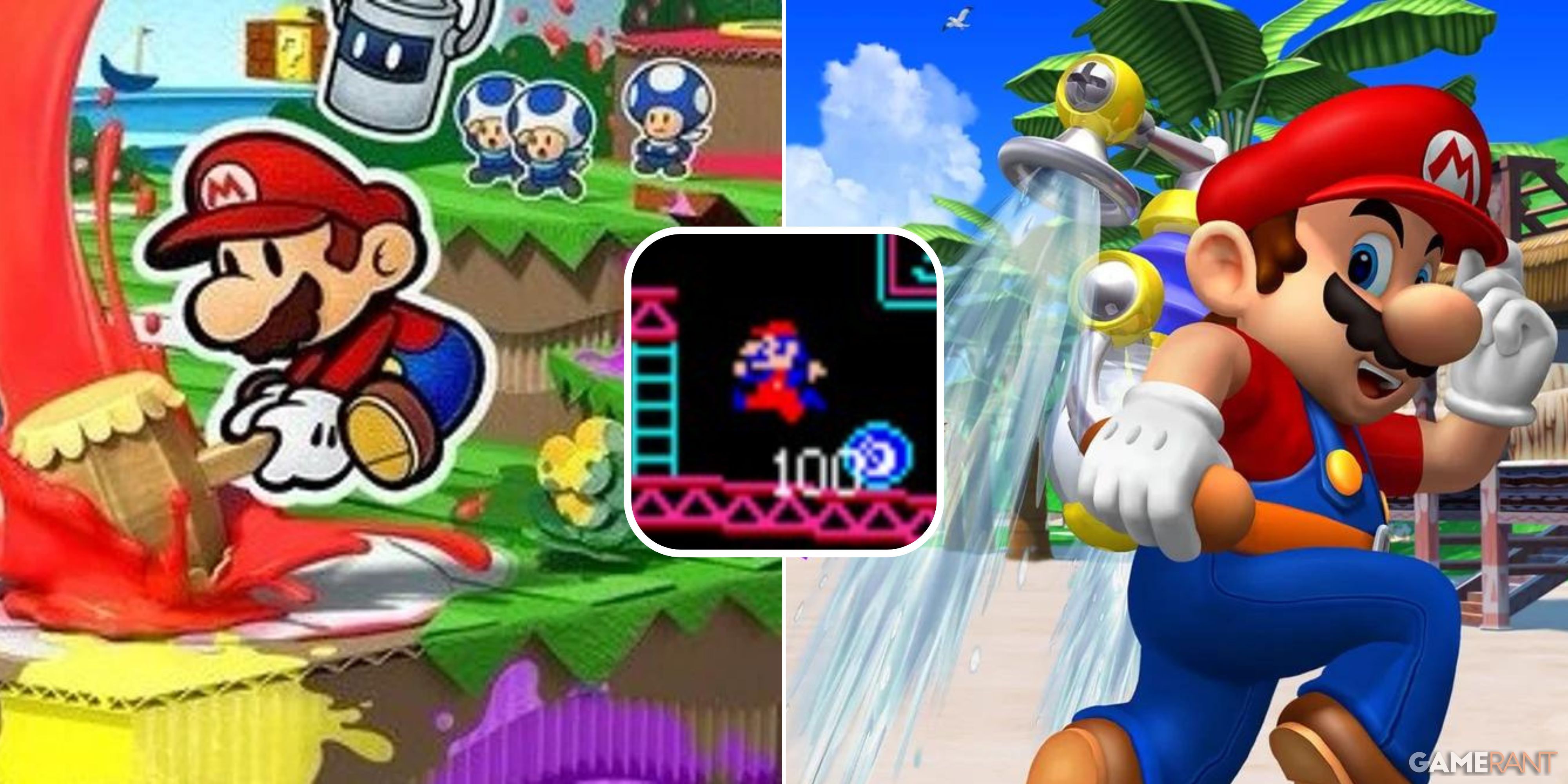
5 Super Mario Sunshine
Short Sleeves For Summer

Super Mario Sunshine
- Released
- August 26, 2002
- Developer(s)
- Nintendo EAD
- Genre(s)
- Platformer
Super Mario Sunshine just gives off a “Summertime fun time” vibe. Mario sports a similar look to his modern design, except this is the first and only time we would see his iconic look with such short sleeves. This design also has the Flash Liquidizer Ultra Dousing Device, or F.L.U.D.D. for short, on Mario’s back.
This is no mere aesthetic, as many of the game’s core mechanics revolve around using the F.L.U.D.D. The F.L.U.D.D. was created by Professor E. Gadd, better known for his appearances in the Luigi Mansion games, and has also appeared in other games and media across the Mario Franchise.
4 Paper Mario
Old School Mario Never Looked Better Than This

Paper Mario
- Released
- February 5, 2001
Paper Mario is the perfect way of showcasing the original Mario sprite’s design as a high-quality image. His little beady eyes are depicted as dots, the split in his sideburns is not too prominent, and his scrunched-up body just screams classic Mario.

Related
Every Super Mario RPG, Ranked
For over 20 years, Mario RPGs have been a surprise gem for Nintendo fans. They balance the cartoonish world of Mario with JRPG gameplay.
This would be the ideal direction to go for a from-the-ground-up remake of the original classics. While the design might be amazing, the gameplay elements are a drastic departure from the Super Mario Bros. style of gameplay, as well as the execution of the game’s art direction.
3 Super Mario 64
A Flawless Modern Design

Super Mario 64
- Released
- September 26, 1996
- Developer(s)
- Nintendo
- Genre(s)
- 3D Platformer
The Nintendo 64 console led to some of the biggest breakthroughs in Nintendo titles, with an overwhelming number of them still being enjoyed by old and new fans alike. This design has Mario’s Iconic “M” on his hat, a red trim, and detailed blue eyes. One could say that comparing this to a design like Paper Mario is the same as comparing Classic Sonic to Modern Sonic.
While this design might serve as the perfect example, technology continued to improve as the years went by — and fans got some even more polished versions of the plumber.
2 Super Mario Odyssey
A Realistic Approach To Detail

Super Mario Odyssey
- Released
- October 27, 2017
- Developer(s)
- Nintendo
- Genre(s)
- Platformer
Mario’s design for the sensationally well-written Super Mario Odyssey showcases the power of its platform by making his hair look more realistic and elaborate than it has ever appeared. Trimming for Cappy, his overalls and even his overalls’ pockets are instantly noticeable. While this may be the most detailed Mario to have come along, it can also be a lot to take in.
Having more simplistic designs for both Mario and the world around him, makes the games much easier to digest. This is the most similar design to how he appears in the Super Mario Bros. feature film adaptation.
1 Super Mario Wonder
The Perfect Mario Design

Super Mario Bros. Wonder
- Released
- October 20, 2023
- Developer(s)
- Nintendo EPD
- Genre(s)
- Platformer
This is the penultimate design for the Mario character. His hat doesn’t have the on-again, off-again choice of black trim; the iconic “M” is present and clear; every element is detailed, and the graphics are very smooth. The vibrant primary colors pop without the need to make certain elements seem more realistic — such as gold coloring for buttons and lots of strands in the character’s hair.
While the design in Super Mario RPG might come close, this design’s less scrunched aesthetic allows the face to feel a lot more expressive. The closest comparisons to this design used in older games would be from Super Mario 3D World and the Super Mario Galaxy games.

More
The Best 2D Super Mario Games, Ranked
Super Mario is one of the icons of gaming for a good reason, and these are the best of the best of the franchise’s 2D games.